Fixing Broken Windows
Broken Window Theory and how we established visual systems at scale
In 1982, James Wilson and George Kelling wrote about an idea that later became known as the Broken Window Theory. This theory suggests that visible signs of disorder, such as broken windows in a neighborhood, can contribute to an increase in crime and a decline in community well-being.
The theory says that if a broken window isn't fixed in a building, it shows that nobody cares about that place. This can make people think the area is neglected and lacks control, which makes it easier for serious crimes and bad behavior to happen.
And, that if communities take care of small signs of disorder and fix broken windows, graffiti, or other signs of neglect quickly, they can make things more orderly and in control. This can stop bad behavior and make people feel safer and better.
Just like disorder in a neighborhood is bad, ignoring small problems in a digital product can convey a sense of neglect, contribute to a negative perception of the product, and make the user experience worse.
In UX, we can think of these as small usability issues—elements that make the user experience less smooth or confusing. Things like unclear buttons, broken links, or inconsistent design elements.
Why fixing broken windows matters
Fixing these broken windows has remarkable potential in product development:
- User satisfaction. Even small inefficiencies can compound frustration for users who perform repetitive actions daily. Fixing these seemingly insignificant issues is powerful. Often more so than creating new features.
- Usability and trust. When we address minor issues, we make the product easier to use and signal that we care about quality. This builds trust and loyalty. Users see their feedback acknowledged and acted upon.
- Business impact. When users encounter fewer obstacles, they engage more, retain longer, and recommend the product to others. Quality improvements directly influence growth metrics.
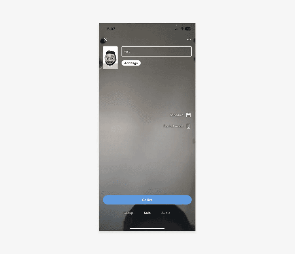
How we identified broken windows
At Kumu, we didn't stumble upon these issues randomly. We built a systematic process to surface quality problems that users had learned to live with.
App store reviews. We analyzed user reviews from the iOS App Store and Google Play Store, looking for recurring complaints and friction points. These reviews often captured frustrations that users experienced repeatedly but never formally reported. Comments like "why is this so hard to find?" or "I keep accidentally tapping the wrong button."
User research synthesis. We reviewed findings from user research sessions, specifically looking for moments of hesitation, mis-taps, and workarounds. These micro-frictions rarely surfaced in post-session feedback but were visible in observed behavior.
Heuristic audit. We conducted a systematic review against basic usability heuristics—consistency, visibility, error prevention, accessibility. This caught issues like contrast failures and inconsistent button styles that no single user would report but that degraded overall perception.
This combination of qualitative feedback and systematic review gave us a comprehensive picture of where broken windows existed across the product.
From audit to alignment
These fixes weren't arbitrary improvements. They were guided by a design system we created for Kumu.
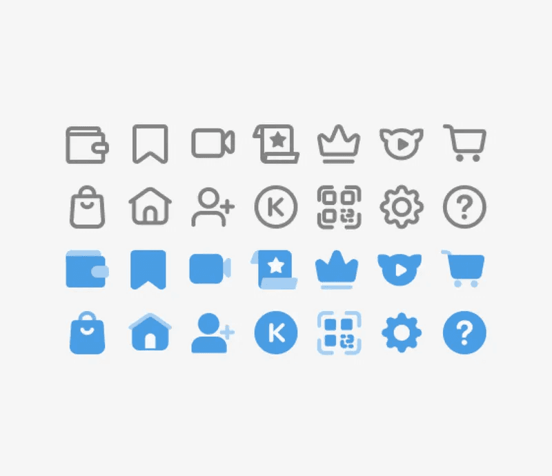
The design system was unified across iOS and Android, defining standards for color, typography, iconography, and component behavior. It gave us a clear benchmark: when the live product deviated from the system, that was a broken window.
- Icon consistency. The system specified a single icon style and rules for outline vs filled states. The audit revealed the app used multiple icon sets.
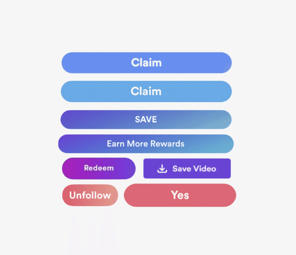
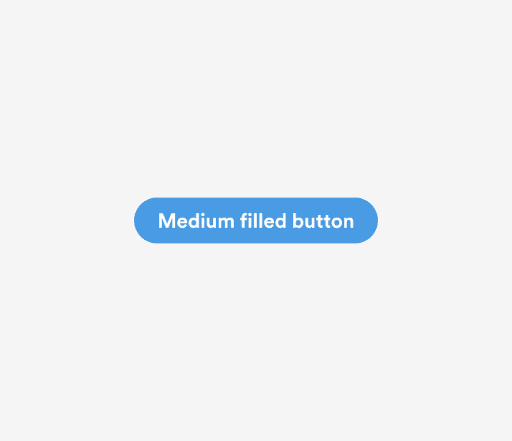
- Button standards. The system defined Kumu Blue (#499CE4) as the primary action color with no gradients. The audit found buttons in various colors and gradient styles.
- Contrast requirements. The system set minimum contrast ratios for text and interactive elements. The audit identified screens that failed these standards.
Having an established system transformed the audit from subjective ("this feels inconsistent") to objective ("this doesn't match the spec"). It also made prioritization easier. We weren't asking for design preferences, we were asking to align the product with agreed-upon standards.
Fixing broken windows at Kumu
Below are some of the highest-impact fixes we made, organized by theme. Each category targeted a clear success metric:
- Navigation clarity: Reduce "Where do I find X?" complaints
- Contrast & accessibility: Improve legibility and meet accessibility standards
- Consistency: Reduce user confusion around primary actions and interface patterns
Navigation icons
 Before
Customer feedback and usability testing revealed that users were unfamiliar with our menu icons and relied on trial and error to find the desired content.
 After
After
Persistently showing menu items' labels enabled a more understandable navigation experience.
Outcome: Navigation-related complaints decreased after launch.
Contrast & legibility
 Before
Users had difficulty reading low-contrast text. They also confused unselected toggles for disabled toggles because the grays were too light.
 After
After
We removed tiny, low-contrast text and went from light grays to darker ones (for both font and toggles). These went a long way toward legibility and usability.
Outcome: Passed WCAG AA contrast requirements across core UI elements.
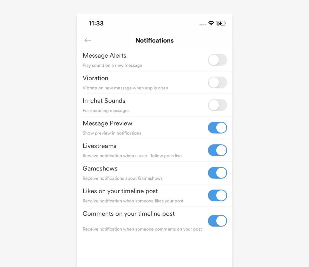
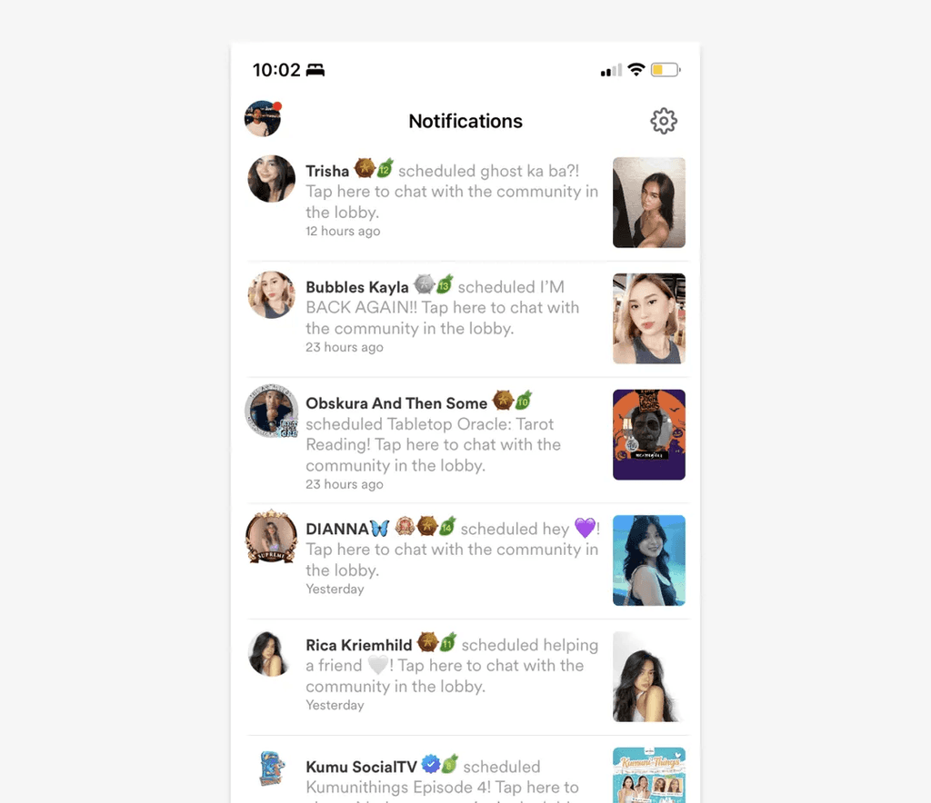
Notifications
 Before
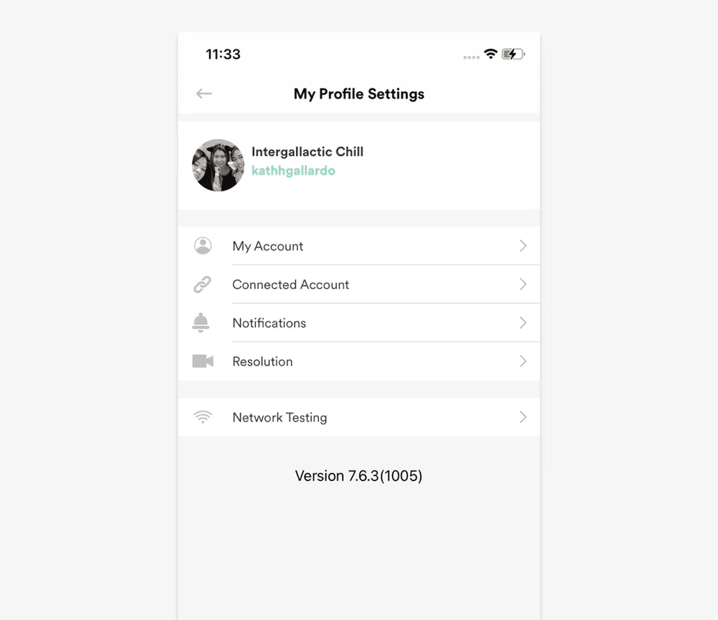
Users frequently complained that Kumu's notifications were spammy. Configuring their Notification Settings was possible but the feature was buried deep under Profile Settings.
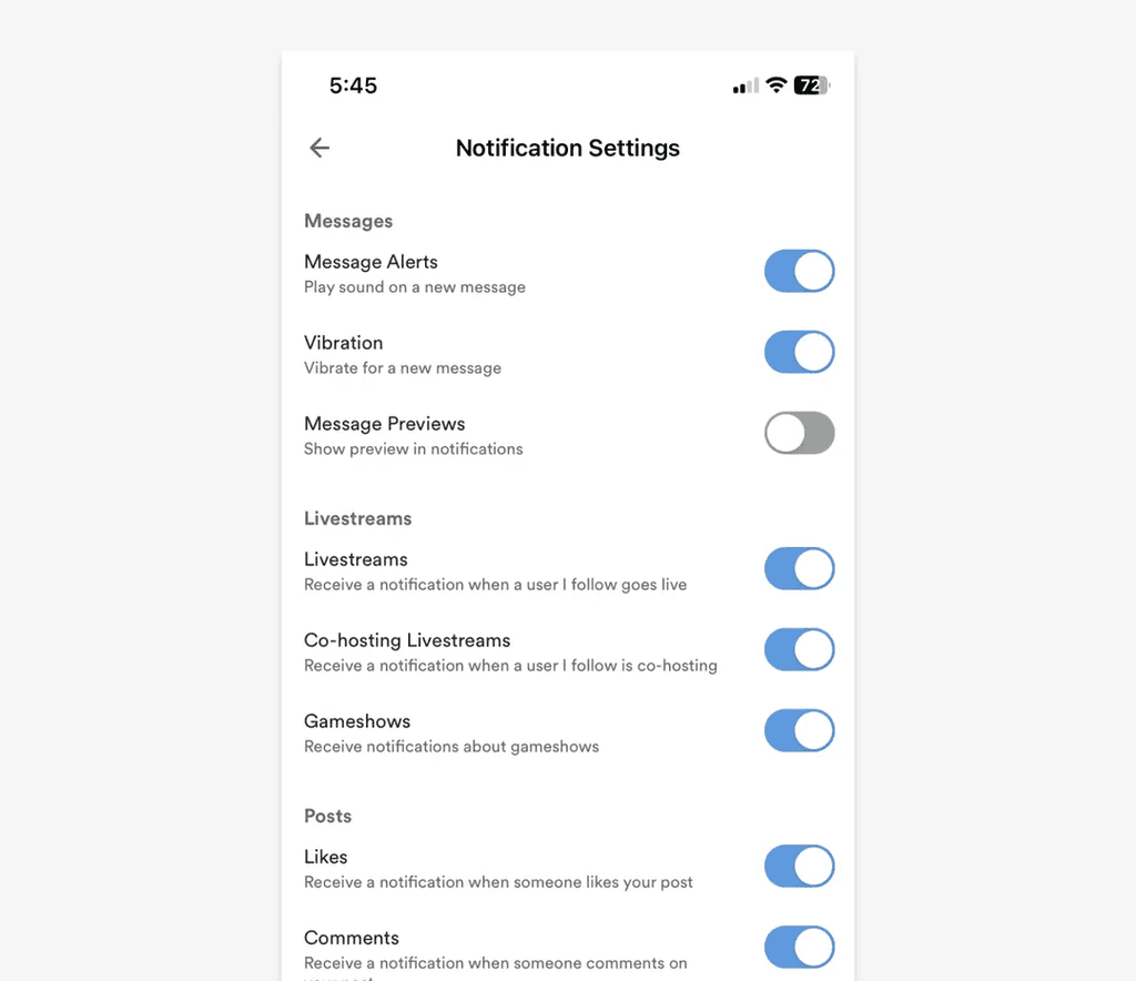
 After
After
By adding an access point to Notification Settings at the top-right of the Notifications page, notification preferences was always just a tap away.
Outcome: "How do I turn off notifications?" complaints decreased.
Video posts
 Before
When scrolling through the feed, users saw large, white margins in video posts and had to tap on the videos to watch them.
 After
After
Videos were resized to fill the screen's width and configured to auto-play when scrolled into view.
Outcome: Video engagement (watch time) increased.
Icon consistency
 Before
Kumu used different icon styles across its interface. This created an inconsistent experience, degrading brand perception.
 After
After
Icons were redrawn in a consistent style. Guidelines standardized when to use an outline icon (unselected states) vs a filled icon (selected states). Even updating just the most visible icons (e.g. navigation icons) was a significant improvement. (An 80/20 effort.)
Button consistency
 Before
Kumu's primary button style varied greatly across the app interface, creating inconsistency.
 After
After
Kumu Blue (#499CE4) was standardized as the only color of primary buttons—no more gradients. A consistently designed and more recognizable primary button reduced users' cognitive load.
 Before
Kumu's primary button style varied greatly across the app interface, creating inconsistency.
 After
After
Kumu Blue (#499CE4) was standardized as the only color of primary buttons—no more gradients. A consistently designed and more recognizable primary button reduced users' cognitive load.
Livestream controls — Minimize/Close
 Before
Kumu's livestream interface had the Minimize and the Close actions beside each other, which frequently caused users to accidentally close a livestream when they intended to minimize it.
 After
After
Minimize (far left) and Close actions (inside kebab menu) were separated. Users were given two options to close a stream, but both required two taps to perform: (1) tap Minimize then tap Close, or (2) tap kebab then tap Close livestream.
Outcome: Accidental stream exits decreased.
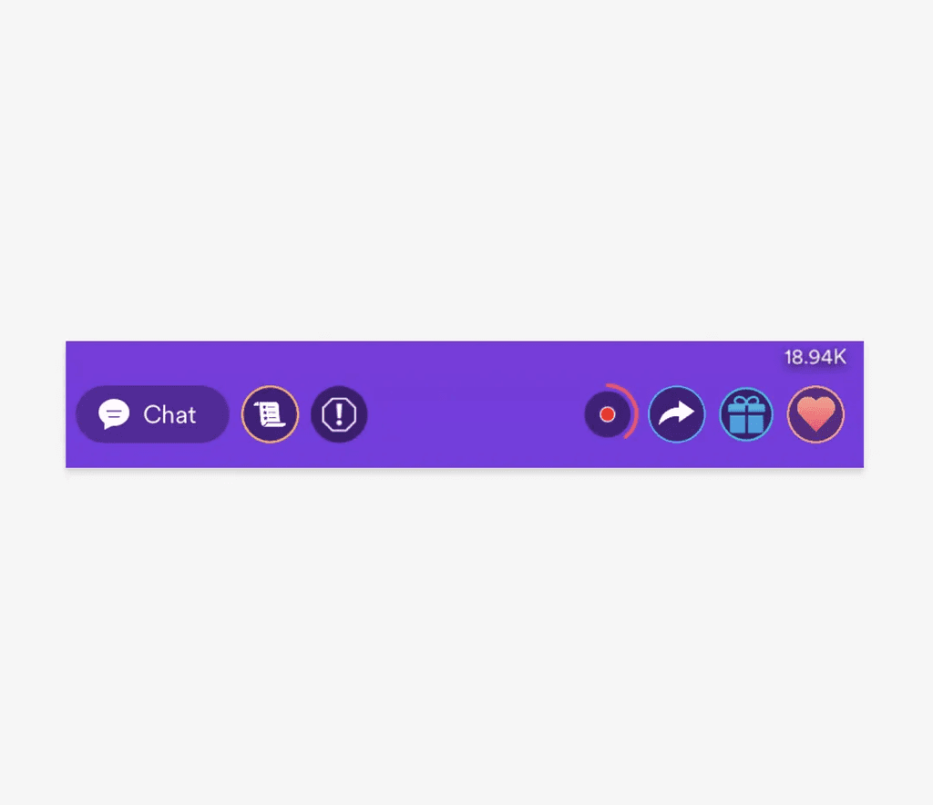
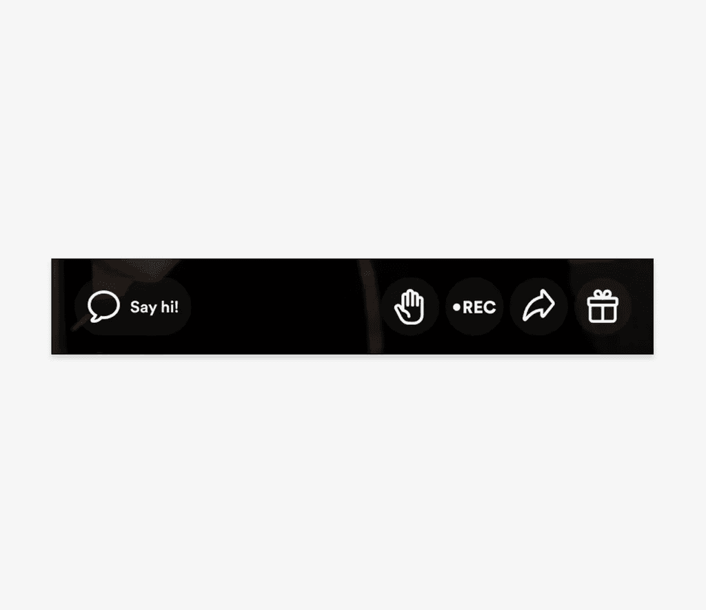
Livestream controls — Like/Gift
 Before
Kumu's livestream interface had the Like and the Gift actions beside each other, which frequently caused users to accidentally send a gift (which cost money) when they were just spamming the livestream with likes.
 After
After
Icon buttons were increased in size for better usability and updated to align with the new designs. The Like button was removed and replaced with the ability to double-tap anywhere on the screen to "like" the livestream.
Outcome: Accidental gift sends (and related refund requests) decreased.
Gradient removal
 Before
Kumu's user interface featured gradients based on its brand colors. These gradients often provided poor contrast when used as background to white text.
 After
After
We removed gradients from the interface and used solid, brand colors that provided good contrast. We used larger buttons to improve usability as well.
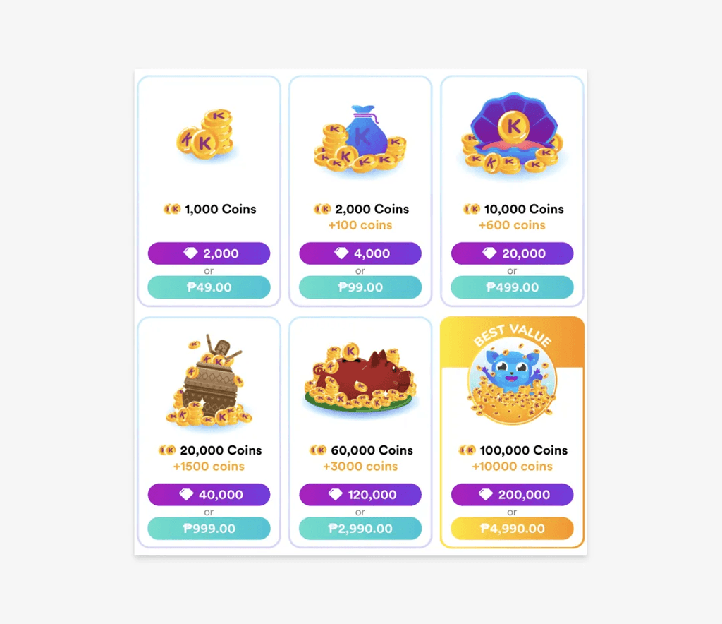
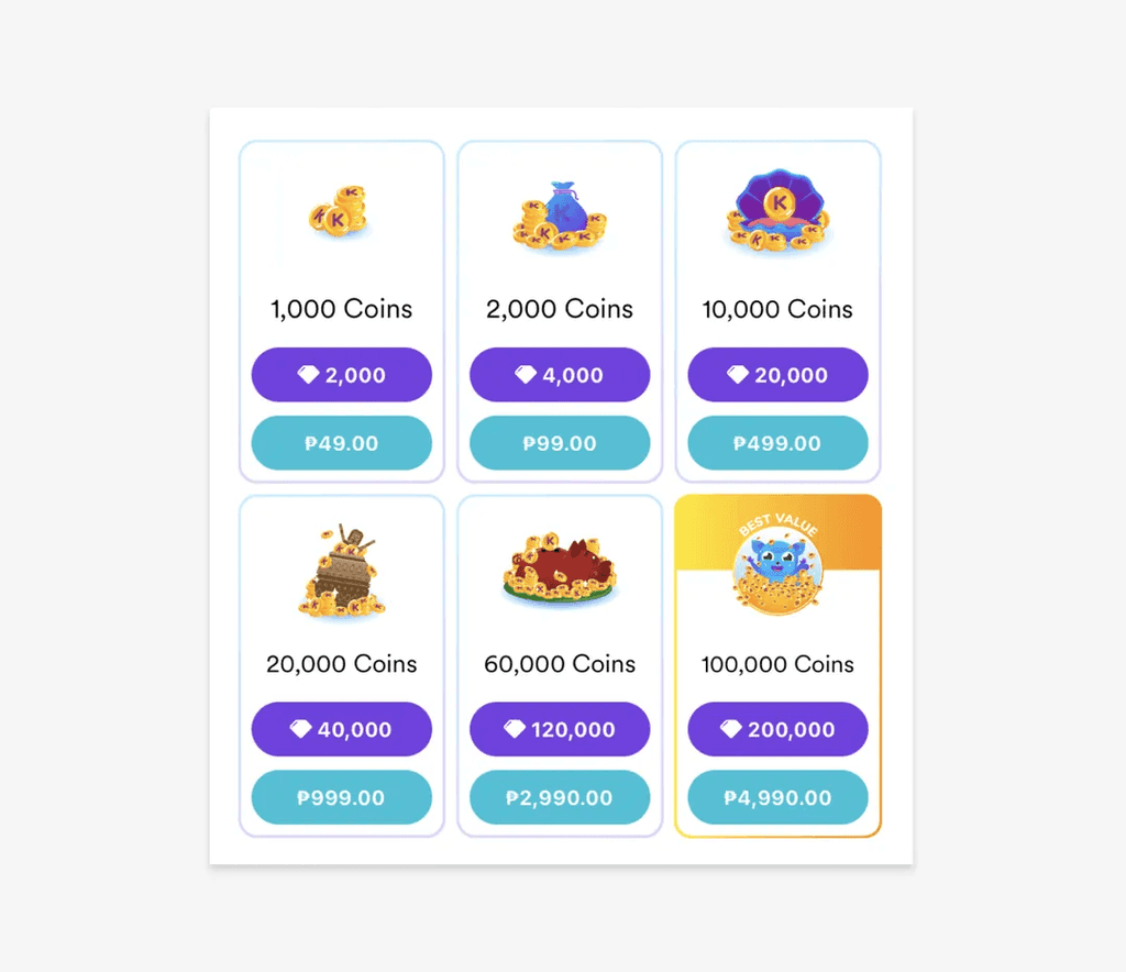
Wallet dark mode
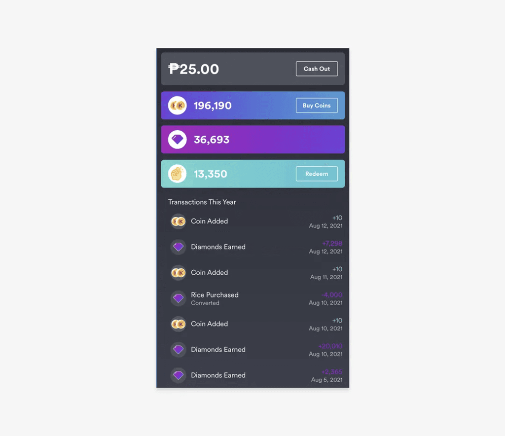 Before
The Wallet screen was the only screen in our whole app that used dark mode. No one knew why. It felt very inconsistent with the whole experience. The copy also used brand colors which contrasted poorly against the dark interface.
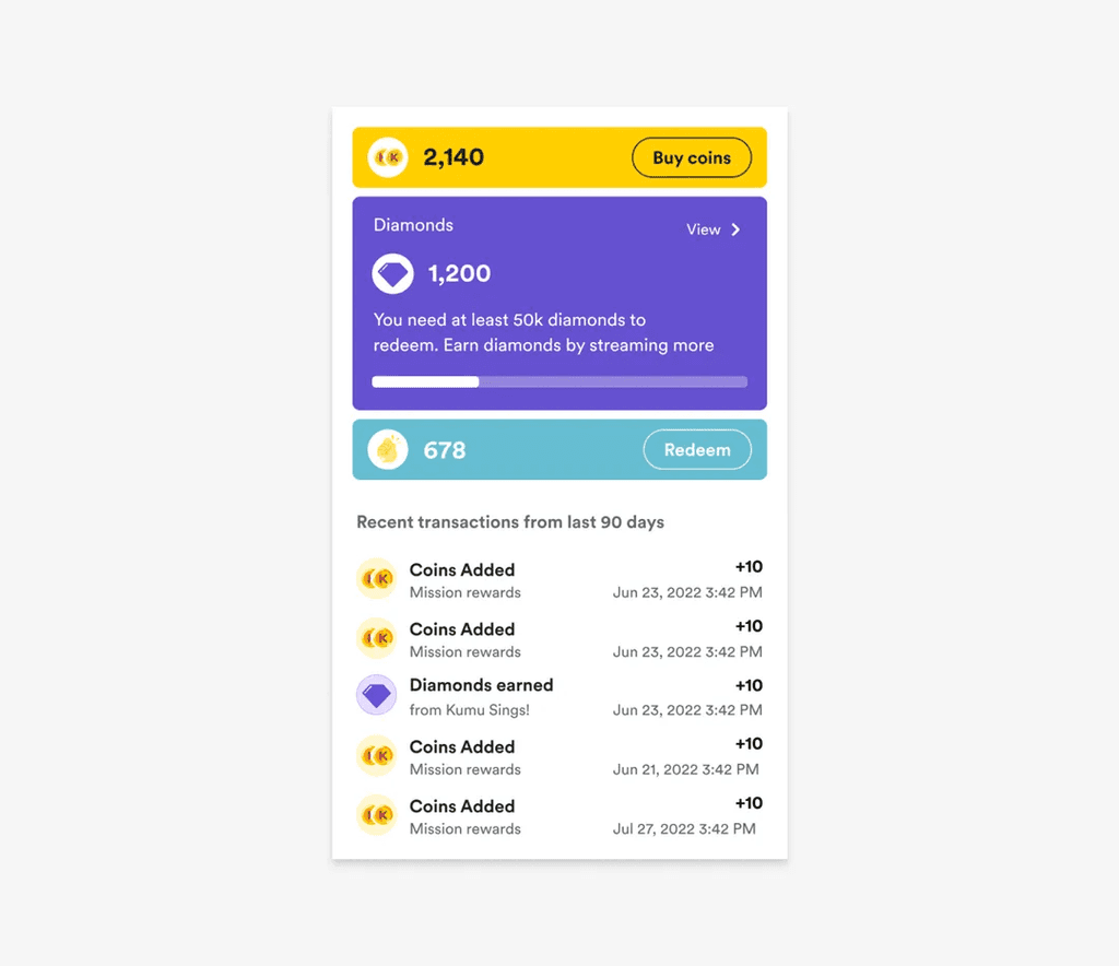 After
After
Dark mode was removed from the Wallet. Solid brand colors were used instead of gradients. Brand colors were also not used in the copy, prioritizing color contrast and readability.
Incremental improvements are key to success in product development. By recognizing that addressing broken windows with these quick wins can yield significant results, we can enhance user satisfaction, improve usability, boost engagement, and build trust.
Getting into the habit of constantly fixing broken windows can improve your brand, set you apart from competitors, and show users that you listen to them and that they can trust you. Most importantly, it helps improve your product and the lives of your users.
Key learnings
- Small inefficiencies almost always go unreported. Users get accustomed to friction—a sort of "learned helplessness." Relying exclusively on direct feedback misses problems users have stopped complaining about. Identifying these requires proactive research: reviewing app store comments, analyzing user research sessions, and conducting systematic audits.
- Accessibility improvements benefit everyone. Better contrast and larger touch targets improve usability for all users, not just those with specific needs. Framing accessibility as universal usability made it easier to prioritize.
- A design system makes quality objective. Without a system, quality discussions become debates about preference. With a system, they become alignment checks. "Does this match the spec?" is easier to prioritize than "I think this looks better."
- Quality work requires a business case. Design changes like these often seem like vanity work. Getting them prioritized requires reframing: not "design cleanup" but "reducing user friction" and "building trust." Connect fixes to user complaints and observed behavior.
- Creating organizational change is harder than fixing UI. The fixes shown here took a few weeks to design and implement. Getting leadership buy-in to prioritize quality over new features required sustained effort—presenting user feedback, demonstrating the value of consistency, and showing results over time.