Kumu App Navigation Redesign
Redesigning how new and existing users navigate and find key features and experiences in the app
How can we make the app easier to navigate for new and existing users?
Restructured the information architecture using familiar navigation patterns
Increased usage for Wallet, Profile, Missions, Watchlist, and Klips
Lead designer, worked on IA, interface design, prototyping, and usability tests
At the time, Kumu was the largest social entertainment app in the Philippines. It had +10 million users (82% Millennial and GenZ) visiting 60 million times per month. Our users average over an hour per day on the app, supporting thousands of income-earning Creators in 50+ countries around the world.
Surveys run by the UX research team showed that newly onboarded users downloaded the app because they saw it in social media ads and they heard it being recommended by Filipino celebrities. They heard that it was a livestreaming app but they didn't understand yet what they could use it for. So, one of our challenges has been onboarding new users and helping them experience the fun of making authentic connections in Kumu.
Why this mattered for business
Confused new users meant lost revenue opportunities. Users who couldn't find key features like Wallet, Missions, or Notifications were less likely to engage with monetization touchpoints or build the habits that drive retention. With Kumu investing heavily in user acquisition through celebrity partnerships and social media ads, every churned user represented wasted marketing spend.
Our hypothesis: improving the information architecture would increase feature adoption and reduce new user churn by making the app's value proposition clearer from the first session.
"How might we make the app easier to navigate for both new and existing users?"
What We Knew
New users want to establish a mental model of the app
Looking at app reviews, we saw that “confusion” was a common sentiment from new users. And, based on research conducted by the UX research team, we also learned that new users felt the homepage was overwhelming. They would spend hours scrolling through the homepage and joining streams to try to understand how to use Kumu.
This was supported by data too. We saw that one of the first things new users did was click around, explore the app, and try to get a feel of what Kumu is and what they could do here.
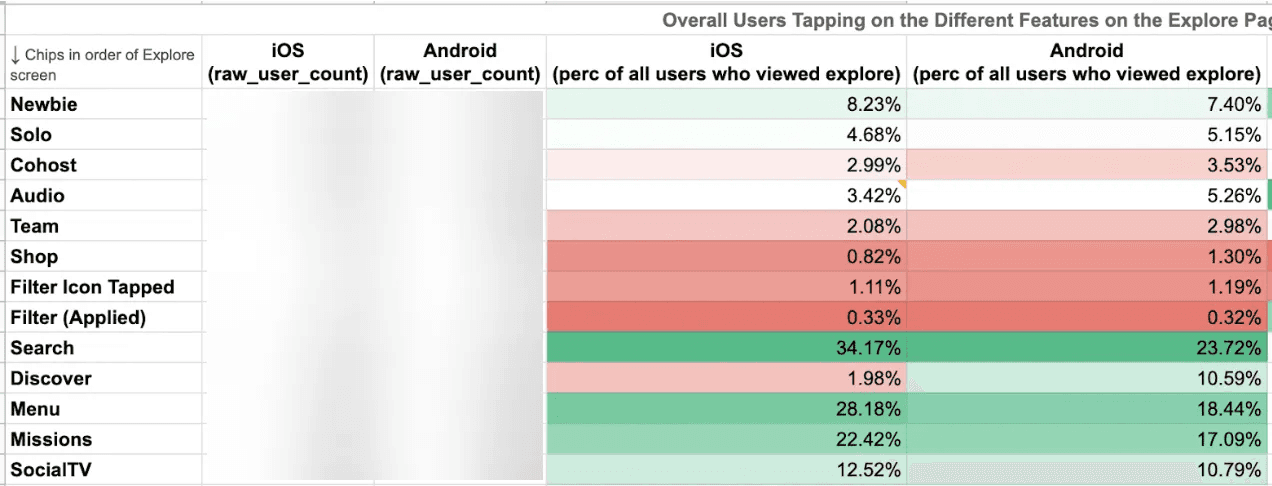
A high percentage of new and existing users use Search, the side menu, Missions, and Social TV
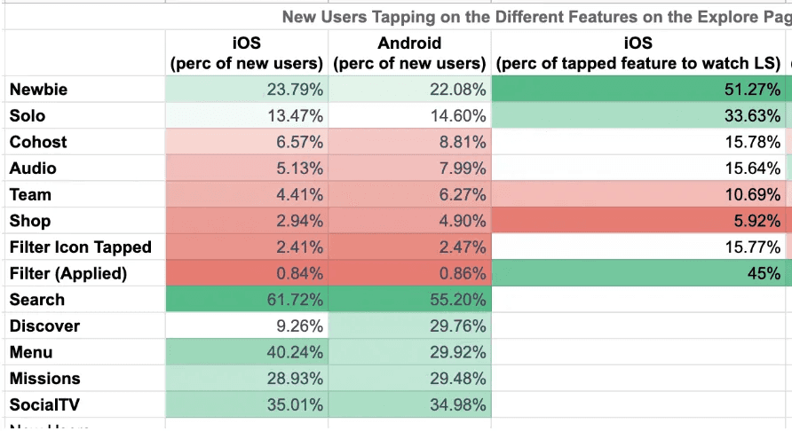
A high percentage of new users explore Search, Discover, the side menu, Missions, and Social TV.
“Daming kailangan aralin pag new users. Pumapasok ako sa streams para matuto. Iniexplain lang niya kung paano gamitin. Masungit din siya so hindi ko po makausap ng maayos.”
(Translation: You need to learn a lot as a new user. I enter streams to learn. They explain how to use it. But they’re grumpy so you can’t talk to them properly.)
Kumu's app information architecture was poor
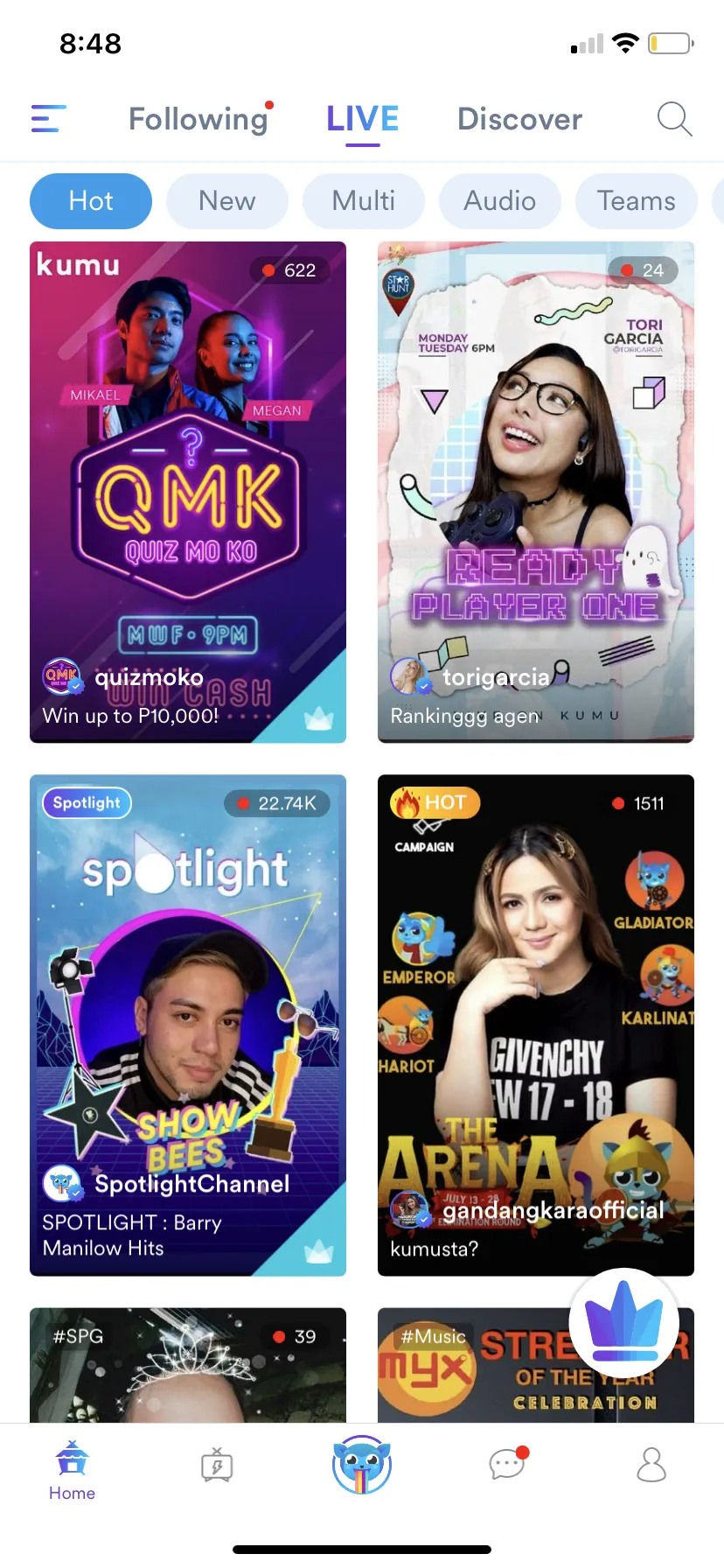
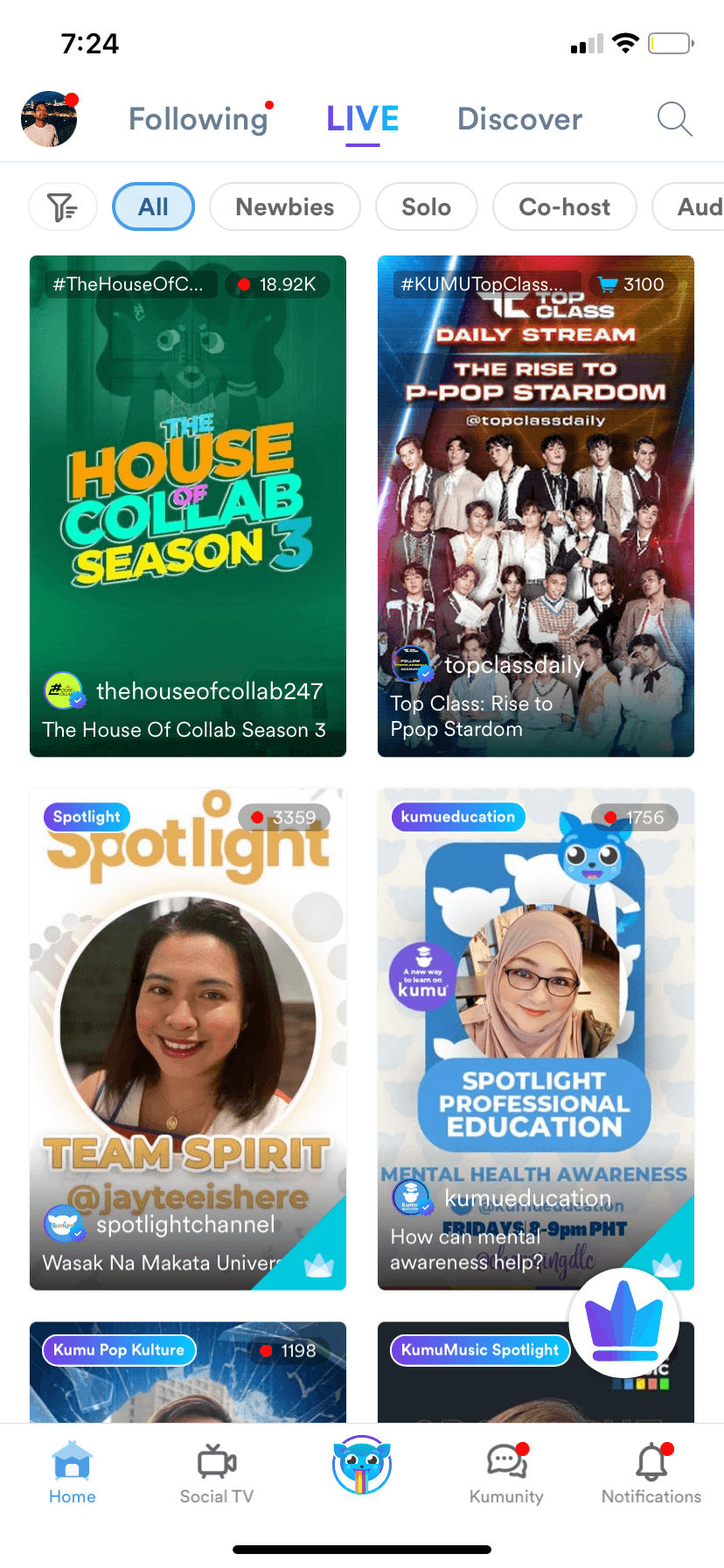
Homepage
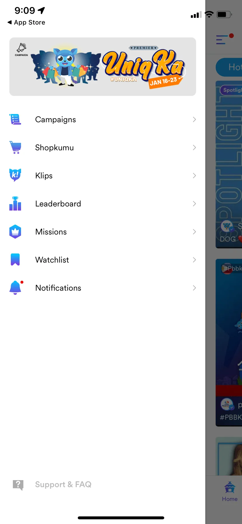
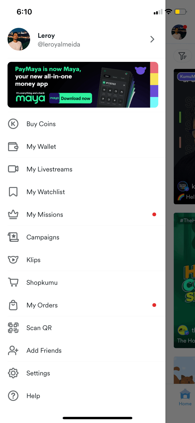
Side Menu
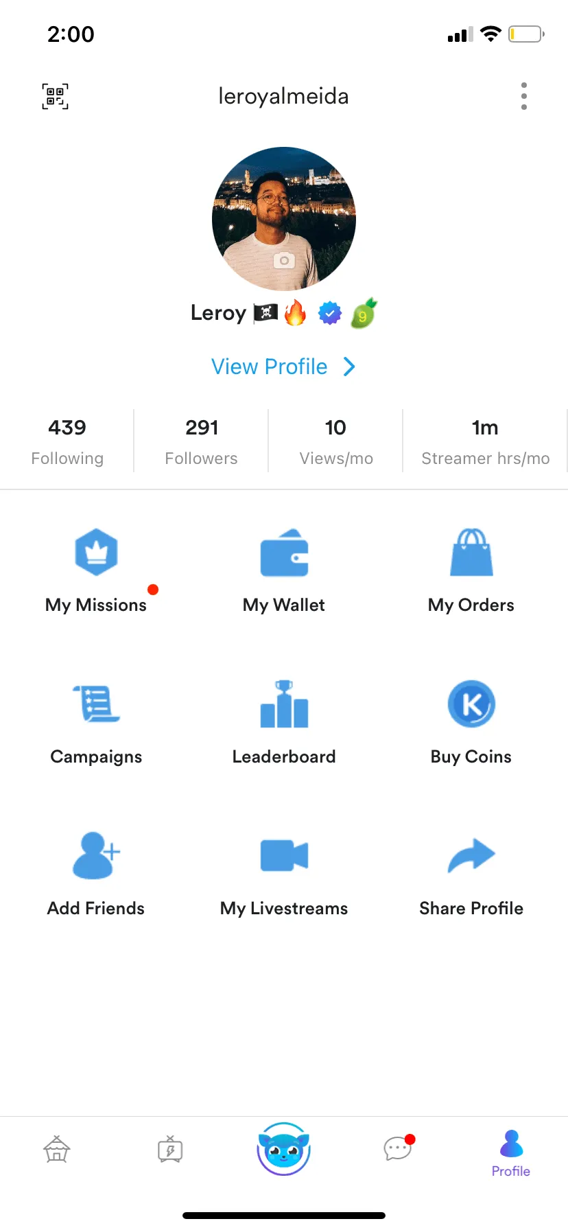
Profile Menu in main navigation
Screenshots above show what new users would’ve seen on the Homepage, the Side Menu, and the Profile Menu. Notice duplicate menu items like Campaigns, Missions, and Leaderboard.
Even though we provided new users with a quick onboarding tour, there was a lot of jargon left unexplained. When we talked to our users, these were some of the common sentiments:
- (From the homepage) What does Following mean? What are Hot, New, Multi, Audio, and Teams? What do the icons in the bottom navigation mean?
- (From the side menu) What are Campaigns, Klips, Leaderboard, and Missions?
- (From the Profile menu) This isn’t what a Profile page in a social app usually looks like? Is the Missions here different from the one on the side menu? What about Campaigns and Leaderboard?
We learned that new users were overwhelmed with the variety of features they saw when exploring the app and this made it more difficult for them to understand and experience the value proposition.
Our hypothesis was that, to make the app easier to understand for new users, we needed to improve core navigation and steer users toward key jobs-to-be-done.
“Information architecture is the way that we arrange the parts of something to make it understandable.”
— Abby Covert, How to Make Sense of Any Mess
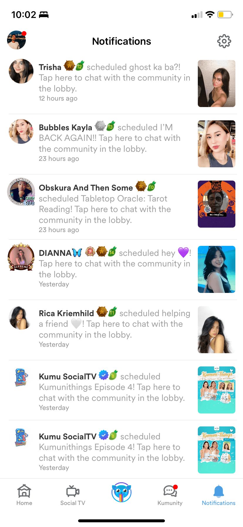
Notifications are a critical part of the Kumu experience
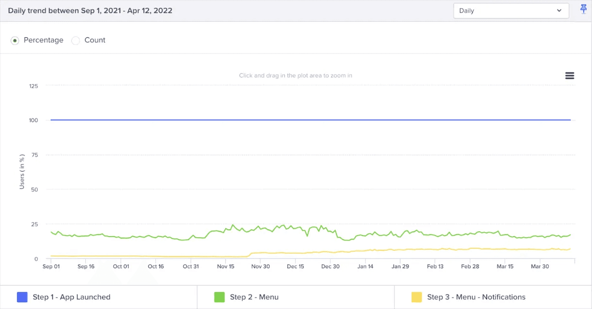
When we looked at the data, we saw that the Notifications page (which was still buried in the side menu) had increased usage after we released the “User Followed You” notification.
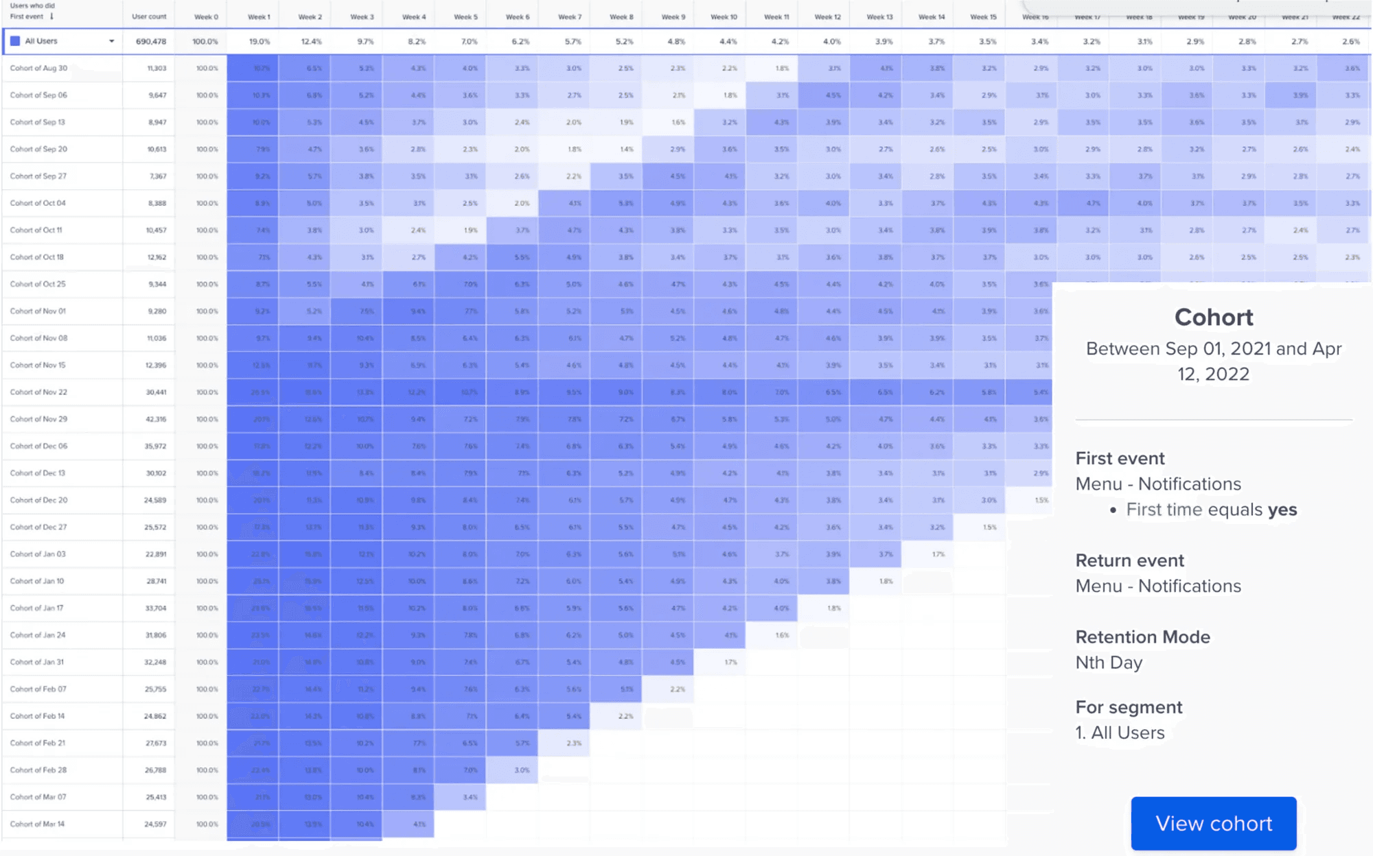
The sustained week-on-week engagement since new notifications were launched tells us this feature is valuable to users
We looked more into the data and saw that less than 25% of users clicked on the side menu. But, of those who clicked on the side menu, 50% clicked Notifications, which had the highest click-thru rate among the menu items.
50% of users who viewed the Side Menu opened the Notifications page
Design Strategy
Knowing what we know, this was the emergent strategy:
- Remove redundant elements. Streamline the different menus to eliminate duplicate paths.
- Elevate key features. Bring critical features, like Notifications, to the forefront.
- Adopt familiar patterns. Leverage navigation conventions users already understand.
Exploring solutions
We had been contemplating how to tackle rearranging the app's navigation for a few months. Kumu's Chief Product Officer came up with an initial draft for a new information architecture. Over the next few days, I developed four additional explorations to give us options to evaluate.
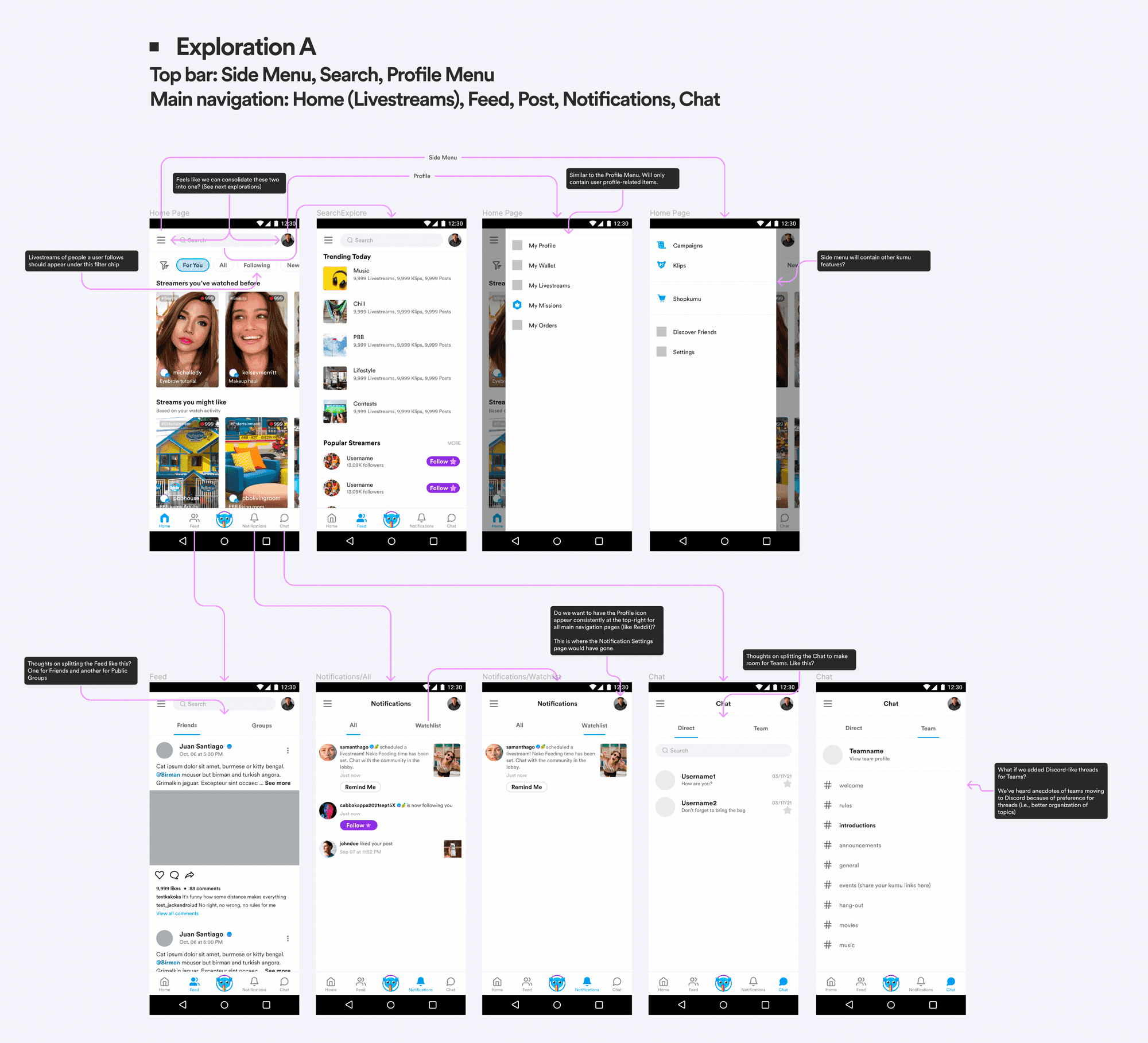
Exploration A
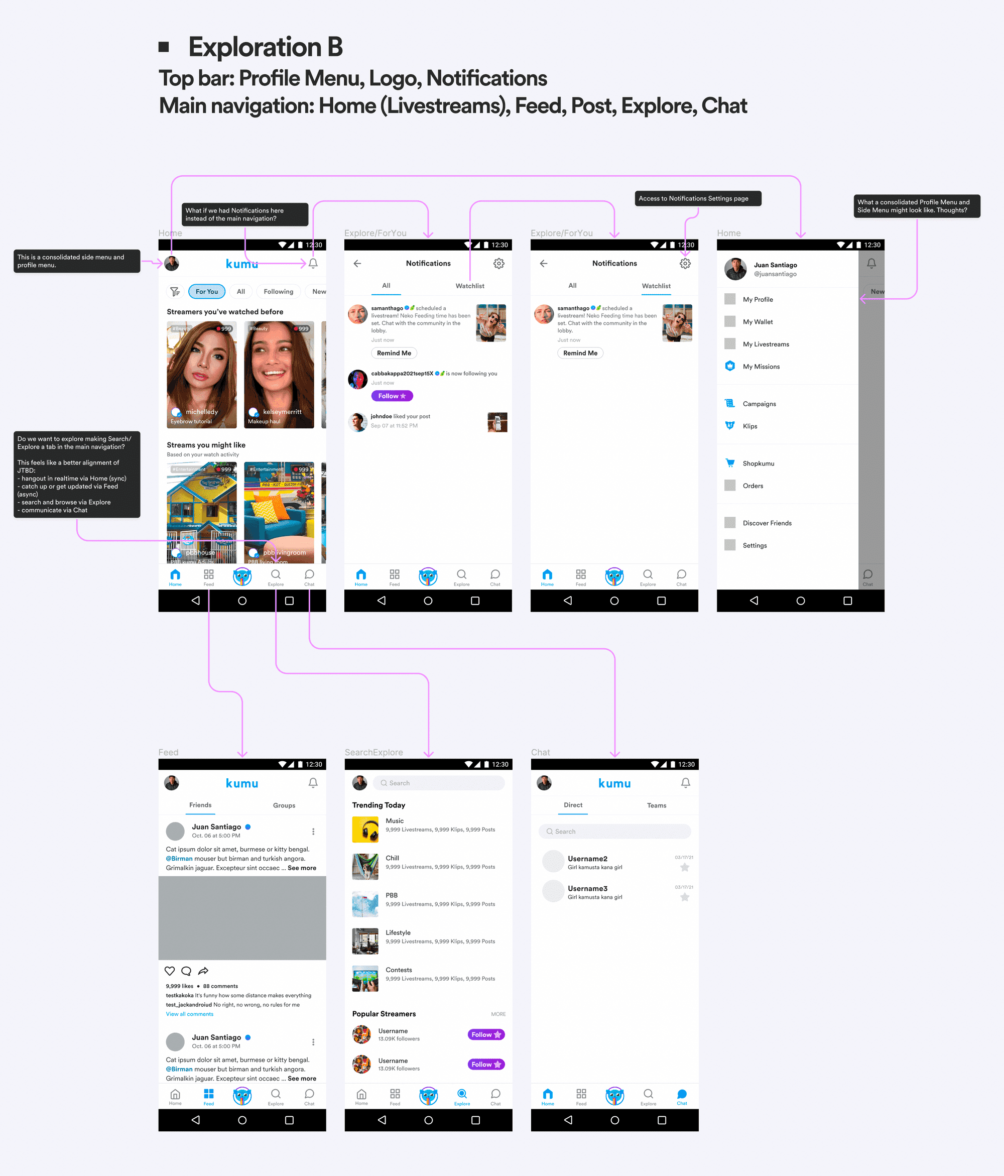
Exploration B
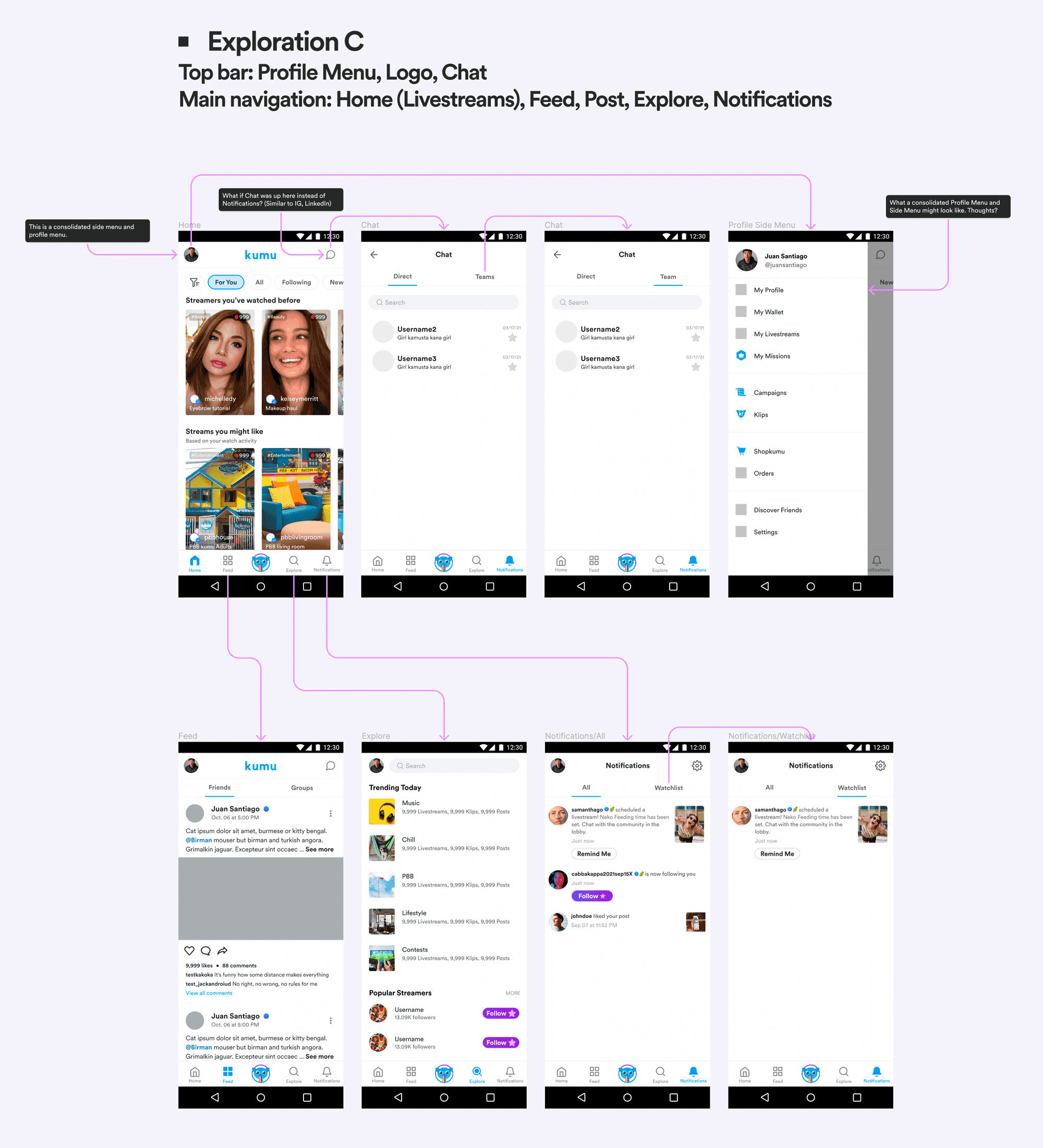
Exploration C
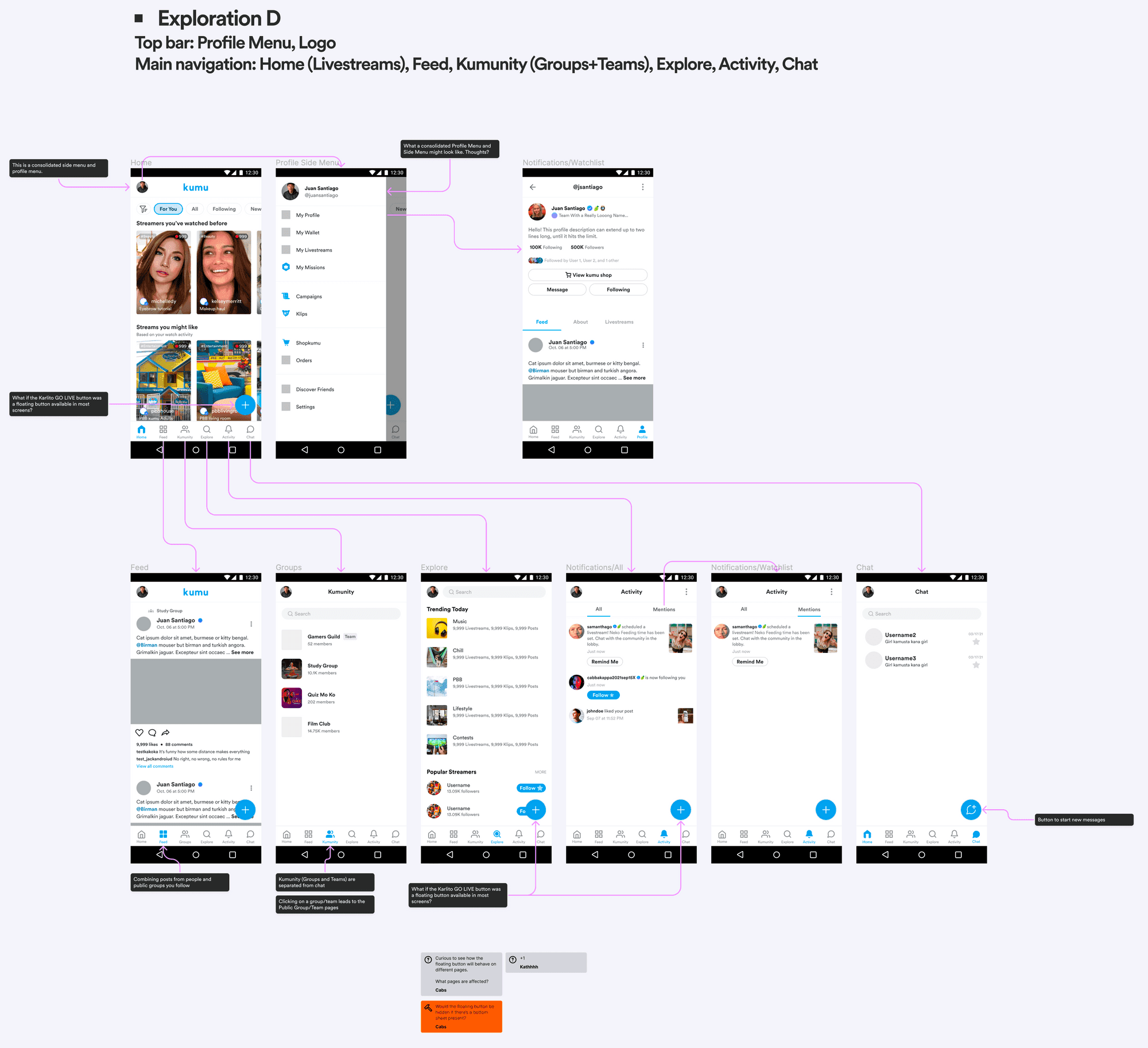
Exploration D
Evaluating the tradeoffs
I evaluated each exploration against three criteria based on our research findings: familiarity (does it use patterns users already know?), simplification (does it reduce redundant entry points?), and feature elevation (does it surface Notifications prominently?).
| Exploration | Strengths | Weaknesses | Recommendation |
|---|---|---|---|
| A | Elevates Notifications to main navigation | Still has separate Side Menu and Profile Menu; doesn't consolidate redundant paths | Didn't solve core IA problem |
| B | Consolidated menus well; Notifications visible in header | Notifications in top bar is less familiar; users may miss it | Less intuitive notification access |
| C | Familiar pattern (Instagram-like); consolidates menus; elevates Notifications to main nav | Requires users to learn new Profile location via avatar | Recommended |
| D | Surfaces many features directly in navigation | 6-tab navigation is crowded; "Kumunity" and "Activity" labels unfamiliar to users | Too complex for new users |
Based on this analysis, I recommended Exploration C. It scored highest across all three criteria: it mirrored the information architecture of apps like Instagram, Twitter, and LinkedIn that our users already understood; it consolidated redundant entry points under a cleaner side menu; and it gave Notifications a prominent spot in the main navigation. This aligned with the CPO's strategic direction, and we decided to move forward with validation testing.
Exploration C: Recommended for its balance of familiarity, simplification, and feature elevation
Validation
Since this was still an educated guess, our next step would be to test if the new information architecture solved our problems. And, because this was a massive change in navigation, we also wanted to know if the change might harm existing user flows.
- Will users know where to access their Profile?
- Will users know where to find their notifications?
- Will users know how to configure settings for their notifications?
- Will users know where to access My Watchlist?
- Will users know how to add their FB friends?
- Will users know how to share their profile link?
- Will users know how to scan their QR code?
- Will users know how to edit their addresses?
Usability Test Summary
Getting help from the UX research team, here’s a quick rundown of the completion rate of each task:
- Accessing Profile - 93.75% completion rate
- Accessing Notifications - 93.75% completion rate
- Accessing Notification Settings - 100% completion rate
- Accessing My Watchlist - 66.75% completion rate
- Adding FB friends - 81.25% completion rate
- Sharing profile link - 68.75% completion rate
- Scanning QR code - 87.5% completion rate
- Editing my address - 81.25% completion rate
Overall, participants shared they had a good experience with the navigation redesign.
"All of us are used to seeing notifications here [Menu Tab]. It makes me want to see if I’m gaining more followers, are my friends livestreaming? Notifications won’t get buried anymore."
— Participant #2
"The notifications tab at the bottom navigation is very helpful. Before I had difficulty in seeing my notifications because I had to access the Menu and sometimes the profile page."
— Participant #7
Addressing lower completion rates
Two tasks showed lower completion rates: Accessing My Watchlist (66.75%) and Sharing profile link (68.75%). I assessed these results against our core objectives and determined they were acceptable risks for launch.
Watchlist was a secondary feature primarily used by power users who would adapt to the new location. Profile link sharing was an edge case that didn't impact the core navigation goals of reducing confusion and elevating Notifications. The primary flows (accessing Profile at 93.75%, Notifications at 93.75%, and Notification Settings at 100%) all exceeded our success threshold, validating that the redesign achieved its main objectives.
On July 1, we released the updated Side Menu, which consolidated feature entry points (including duplicates) from under the Side Menu and the Profile Menu. On July 20, we completed the switch and removed the old Profile Menu entry point in the main navigation, replacing it with Notifications.
Results
Before
Homepage
Side Menu
Profile Menu
User's public profile
After
Homepage
Side Menu
Notifications page
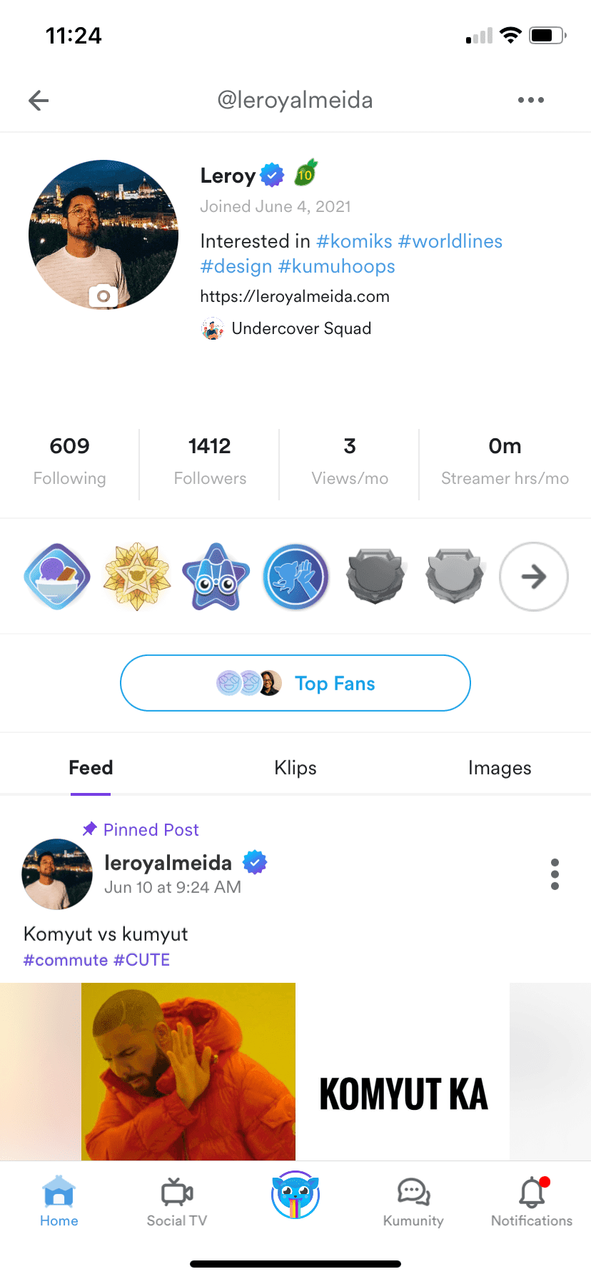
User's public profile
Impact on Metrics
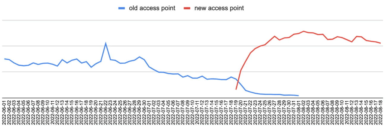
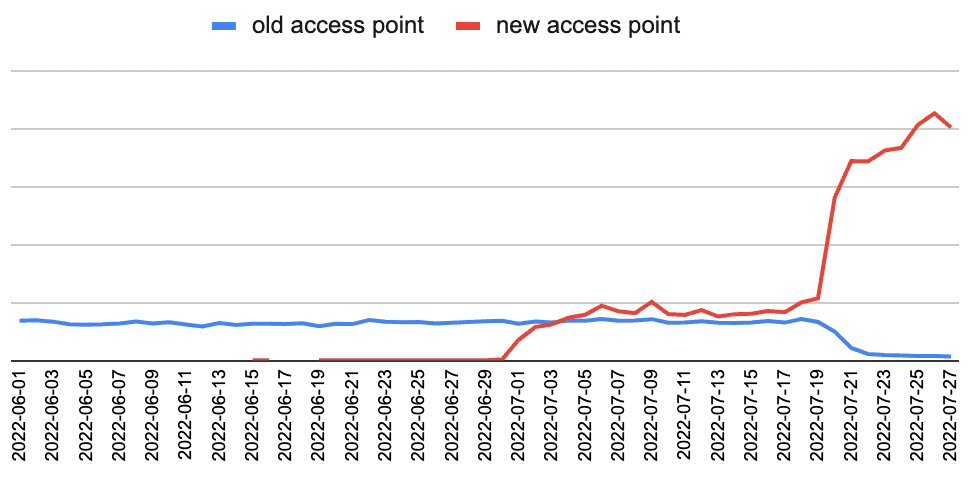
Notifications views more than doubled after moving to main navigation. The July-1 dip was when we consolidated features in the Side Menu. The July-20 spike was when Notifications moved to the main navigation bar.
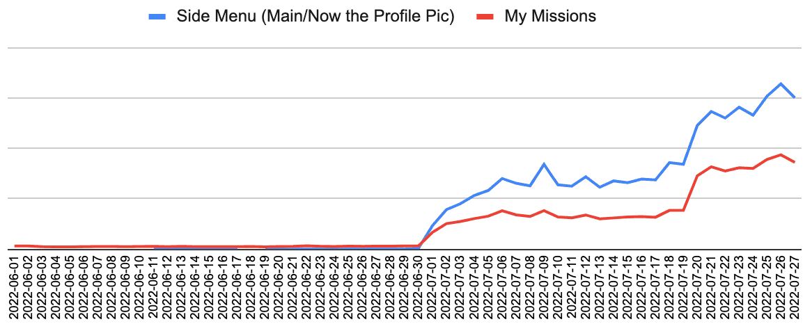
My Missions views increased substantially with improved discoverability in the side menu
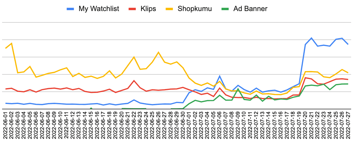
My Watchlist and Klips both saw meaningful upticks, along with a revenue-generating Ad Banner that benefited from increased side menu traffic
Wallet usage increased substantially once duplicate entry points were consolidated. Users no longer had to guess which path led to their wallet.
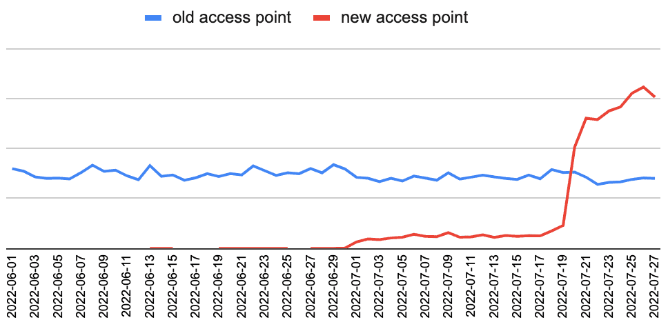
Profile views jumped noticeably by July 20 as users discovered the new access point via their avatar in the header
Key Learnings
- Moving forward under ambiguity: We didn't have perfect data on user navigation patterns, but the cost of inaction was higher than the cost of testing a well-reasoned hypothesis. Usability testing validated our approach with 93%+ completion on core tasks.
- Design as a research tool: With UX Research constrained by their backlog, I used tangible design explorations to make abstract navigation problems concrete. This generated stakeholder alignment faster than waiting for comprehensive research and gave us artifacts to test against.
- Behavioral data over stated preferences: Analytics revealed Notifications' importance even though users didn't explicitly ask for it. The 50% click-through rate from the side menu signaled latent demand we could unlock through better placement.
- Strategic prioritization in testing: Not every task needed 90%+ completion. Accepting lower rates on secondary features (Watchlist, profile sharing) let us ship confidently while protecting the core navigation improvements.
- Phased rollout as risk management: Releasing the side menu consolidation two weeks before the navigation bar change let us isolate variables and build confidence before the higher-stakes update.
- Knowing when to ship: With more time, I would have explored improving Watchlist discoverability. But the core navigation wins were substantial enough to justify shipping, and waiting for perfection would have delayed value for millions of users.