Philippine Airlines Website
Increasing PAL's online revenue by improving content discovery and accessibility
Improve the website so PAL increases online revenue by 20%
Improve content discovery and overall accessibility especially on mobile
15% more mobile sessions, 12% more new users, 28% more visits to other pages, 100% more traffic from home page to booking flow
Sole designer, conducted benchmark studies, sitemap evaluations, information re-architecture, interface design, and prototyping
Philippine Airlines is the flag carrier of the Philippines. It flies approximately 15 million passengers per year.
In 2018, PAL wanted to increase their online revenue by 20%. Their digital marketing team decided that improving the website can help achieve this.
"How can we improve the website so PAL increases online revenue by 20%?"
Navigating organizational complexity
I joined this project mid-stream, after research was complete but before design execution. The project team needed a second designer, but within two weeks, I became the lead designer when the original designer transitioned to another project.
This created an immediate challenge: I needed to quickly build credibility with stakeholders who had already invested months in research, while also identifying gaps in the proposed approach. The research was solid, but the recommended solutions didn't account for PAL's technical constraints or organizational realities.
Key constraints I discovered:
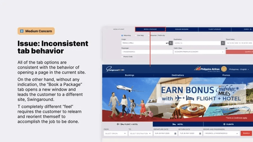
- Legacy booking engine: The booking flow was powered by a third-party system (Amadeus) that couldn't be redesigned without significant backend work
- Marketing vs. Product tension: Marketing wanted maximum promotional real estate; Product wanted clean, conversion-focused design
- Mobile-first mandate vs. desktop revenue: 60% of traffic was mobile, but 70% of revenue came from desktop bookings
- Timeline pressure: 6-month deadline to launch before peak holiday booking season
My role became less about "designing the perfect solution" and more about navigating constraints to deliver maximum impact within organizational realities.
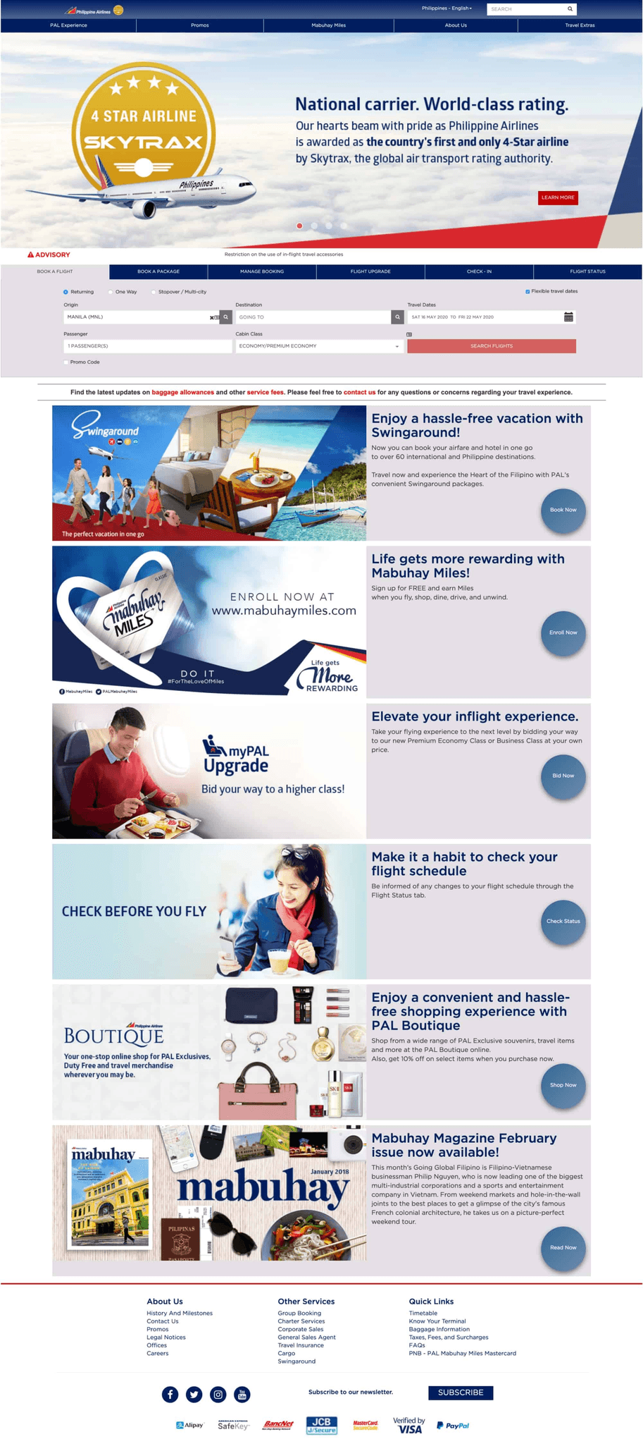
Philippine Airlines' homepage before the redesign
Issues
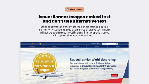
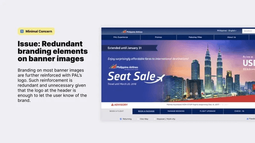
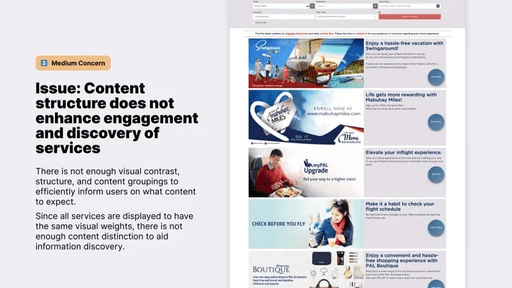
The heuristic evaluation identified several issues, most of which were related to website navigation and accessibility. These issues affected how customers discovered content.
We also analyzed and benchmarked PAL's sitemap against those of other airlines. By analyzing the sitemap, we learned that:
- Key revenue-generating content—like baggage information or seat upgrade information—were buried deep within the site.
- Content wasn't always found where customers expect to find it.
- Some pages were repeated redundantly through out the website. This was information overload for the website's users.
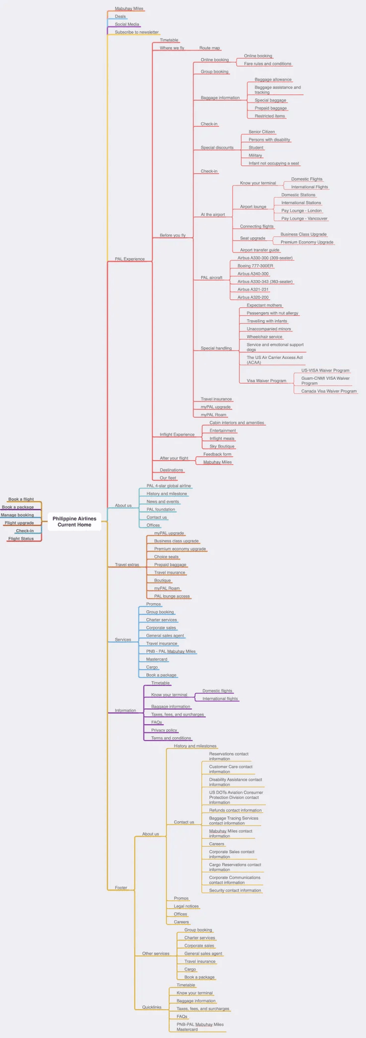
Philippine Airlines' sitemap before the redesign
Aligning stakeholders around constraints
The heuristic evaluation identified 20+ issues. We couldn't fix everything in 6 months, especially with the booking engine off-limits. I needed to align stakeholders around what we could realistically change and what would drive the most revenue impact.
I facilitated a prioritization workshop with Marketing, Product, and Engineering leads:
- Mapped issues to business impact: Which issues were blocking revenue vs. just "nice to have"?
- Assessed technical feasibility: Which fixes required backend changes vs. frontend-only?
- Identified quick wins: What could we ship in phases to show early progress?
The strategic trade-offs we made:
- Deprioritized booking flow redesign (backend constraints) - Focused on improving discoverability of ancillary revenue (baggage, upgrades, insurance)
- Compromised on promotional real estate (Marketing's request) - Gave them Flight Promotions section but separated it from Travel Extras to reduce cognitive load
- Invested heavily in mobile IA (where users struggled most) - Accepted that desktop would get less attention despite higher revenue
This alignment process took 3 weeks but was critical. Without it, we would have designed solutions that Engineering couldn't build or Marketing wouldn't approve.
Design strategy
Given our constraints (legacy booking engine, 6-month timeline, mobile-first mandate), I focused on three strategic bets:
- Fix information architecture - This was frontend-only, high-impact, and could be done without backend changes
- Elevate ancillary revenue products - Baggage, upgrades, and insurance were buried but drove 20% of online revenue
- Mobile-first execution - Even though desktop drove more revenue, mobile users were bouncing at 2x the rate
Each solution below was designed to deliver measurable impact while respecting our technical and organizational constraints.
Restructure the information architecture
In reconstructing PAL’s information architecture, we minimized redundancies—like About Us information—in both main and footer navigations.
We finalized a sitemap that focused in providing logical and intuitive paths to accomplishing user tasks.
In some cases, finding information still takes a user deeper into the site but, now, the website is structured to make it easier to locate information from the home page.
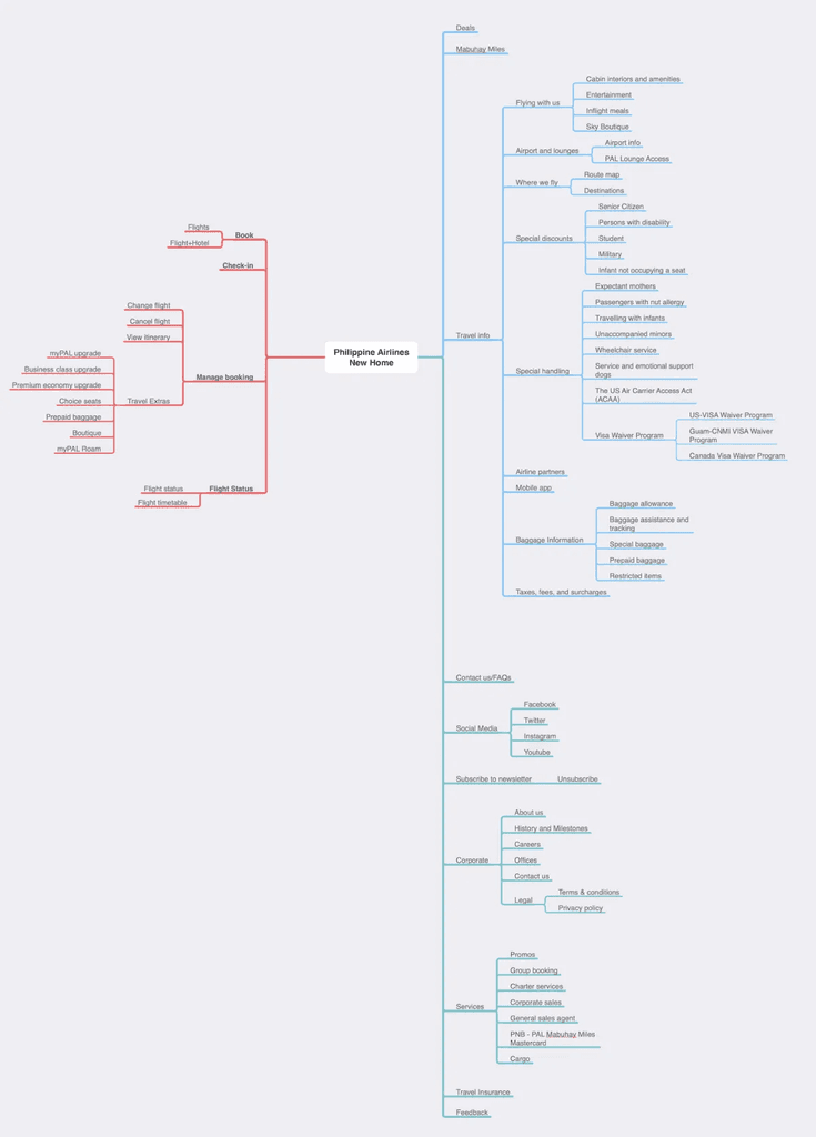
New PAL sitemap. Key actions and information are easier to find.
Make important travel information more discoverable
The new main navigation focuses on providing everything that a customer might need in a more intuitive location. Travel Information is also organized in a way that makes sense to customers. The new design provides quick access to previously underexposed self-service content.

The new website's top navigation contains virtually all information that a customer may need during their customer journey with Philippine Airlines
Place primary actions in an accessible location
Four key customer jobs-to-be-done when the user visits the website are:
- Booking a flight
- Checking in
- Managing a booking
- Checking flight status
These four key customer jobs-to-be-done are now accessible from a single location which is always visible above the fold.
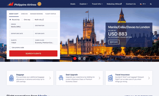
In the new website design, the four key Jobs-to-be-Done (Book Flight, Check In, Manage Booking, and Flight Status) are accessible from a form that is always above the fold
Increase contrast of flight deals vs other promos
We split the current design’s all-the-promos-are-here section into two distinct sections, Flight Promotions and Travel Extras. Grouping information in this manner makes it easier for customers to identify and understand it.
- Flight Promotions offers an easy way to discover cheap trips.
- Travel Extras include promotions for travel insurance and lounges. These provide added revenue for the airlines.
Improve visibility of revenue-generating airline products
The new design puts an emphasis on purchasing extra baggage allowance, getting seat upgrades, and buying travel insurances.
At the time, these three comprised about 20% of PAL's current online revenue.
By placing these options in an area that is consistently above the fold in most devices, we hope to increase its accessibility to customers who need it.
Philippine Airlines' homepage after the redesign
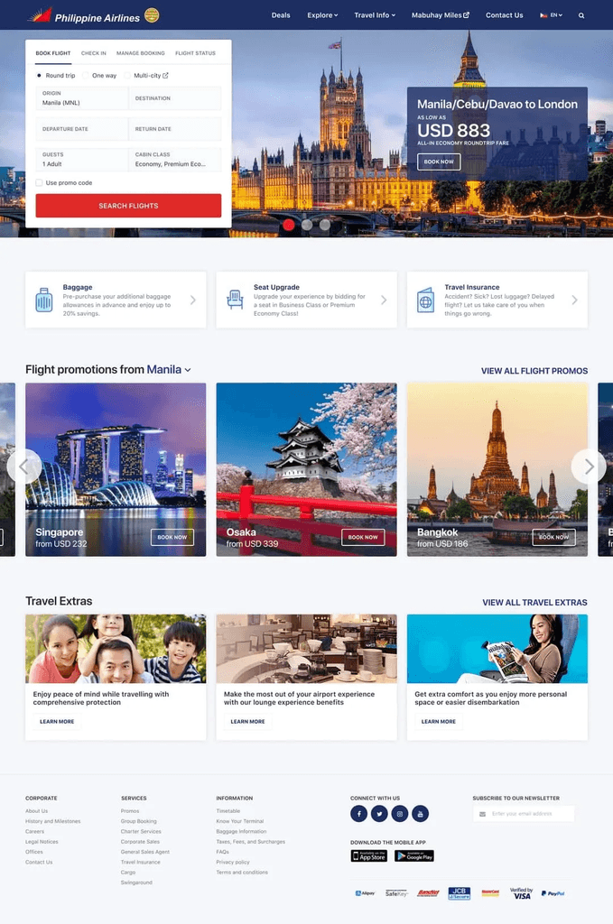
Design for mobile-first
During the study, we learned that a huge percentage of customers viewed the website using their mobile phones.
The new design makes sure that the website is accessible—and beautiful —from a mobile view.
Key actions (booking a flight, checking in, etc) are within reach of the customers thumbs and provide a quick way to complete key tasks. And below these key actions are the revenue-generating content like baggage allowance, seat upgrades, and travel insurance.
Lastly, the navigation sticks to the top to provide quick access to more travel information.
The mobile version ensures key tasks are within reach of the thumb.
The Mobile Paradox: Designing for Traffic, Not Revenue
This was the hardest strategic decision: investing heavily in mobile when desktop drove most revenue. I made the case to leadership that mobile was a conversion problem, not a traffic problem.
Data showed:
- Mobile users had 2x higher bounce rate than desktop
- Mobile users who did convert had 30% lower cart abandonment (once they committed)
- Mobile traffic was growing 15% YoY; desktop was flat
The bet: Fix mobile conversion now to capture future growth. If we only optimized for today's revenue (desktop), we'd miss the shift happening in user behavior.
This required convincing stakeholders to invest in a platform that wasn't currently driving revenue. The key was reframing mobile not as "low revenue" but as "untapped potential."
Key learnings
- Joining a project mid-stream requires rapid credibility building. I had two weeks to understand months of research, identify gaps, and earn stakeholder trust. The key was asking informed questions, not challenging decisions without data.
- Constraints aren't blockers - they're forcing functions for prioritization. The legacy booking engine felt like a limitation, but it forced us to focus on high-impact, frontend-only changes (IA, content discovery, mobile UX) that we could ship quickly.
- Stakeholder alignment is harder than design execution. The actual design work took 8 weeks. Getting Marketing, Product, and Engineering aligned on priorities took 3 weeks. That alignment work was the most valuable thing I did - it prevented months of rework.
- Mobile-first doesn't mean mobile-only. We invested heavily in mobile (60% of traffic) while still respecting that desktop drove 70% of revenue. The strategic bet was that fixing mobile conversion would unlock future growth.
- Measure everything, but focus on leading indicators. We tracked 15+ metrics, but the ones that mattered most were: homepage - booking flow traffic (+100%), pages per session (+28%), and bounce rate reduction (-13%). These predicted the revenue growth before it showed up in sales data.
Results (3 months before vs. after):
- +15% mobile sessions, +12% new users
- -13% homepage dropoff, +100% traffic to booking flow
- +28% pages per session, +6% session duration
According to Sitecore:
- 122% increase in organic search conversions
- 80% increase in web users
- 205% increase in direct search conversions
- 93% increase in web sessions
- 110% increase in social traffic conversions